The app got too heavy. The logo never did.
noodl began as a fully private, on-device LLM. The app proved too heavy to ship; the brand it left behind is the part I'm proudest of.
noodl started as a stubborn little idea: a chat assistant that runs entirely on your own device. No prompts sent to a server, no history sitting in someone else’s logs, no account to sign into. Just you and a model, talking, with nothing leaving the machine in your hand.
Privacy you don’t have to take on faith
Most AI tools ask you to trust a policy. noodl was meant to make the policy beside the point, because there was nowhere for your words to go in the first place. Everything ran locally or it didn’t run at all. That constraint was the whole appeal. It’s a different feeling, typing to a model when you know the conversation can’t end up anywhere you didn’t put it.
Where it got too heavy
In development it was encouraging. It worked, and watching a model answer with the network switched off never got old. But asking a phone to run a capable model is asking a lot. The app grew heavy in every sense: storage, memory, battery, and the patience of whoever was waiting on a reply. Eventually the honest read was that it was too much application for what it gave back, so I set the product down. On-device chat is a prospect I still have a hard time letting go of, and I suspect I’ll come back to it.
The part I’m proud of
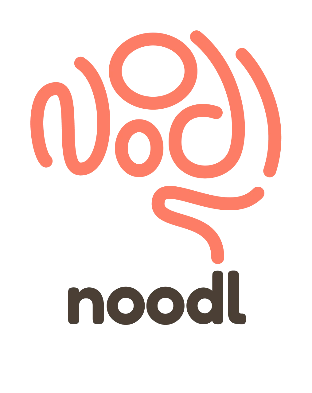
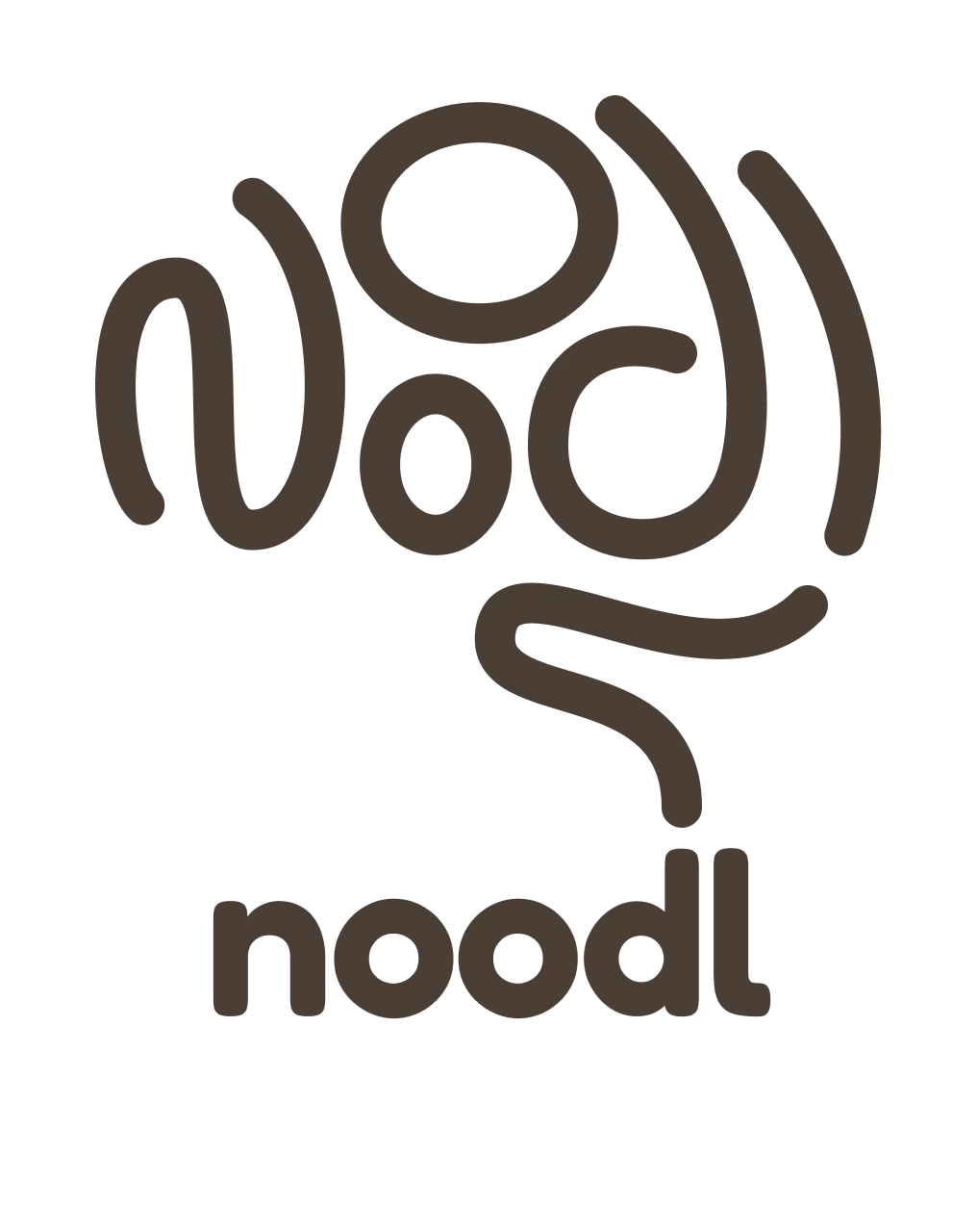
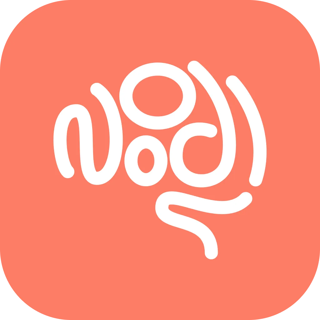
What I didn’t set down was the brand. noodl is a play on “use your noodle,” so the mark is a brain drawn out of noodles: coral, looping, and a little chaotic. It’s fun, it’s quirky, and the name landing on a brain felt inspired the day it clicked. So much AI branding is cold and blue and very serious about itself. This one smiles, and I’m extremely proud of it.
The product may yet come back. Even if it doesn’t, the logo already earned its place. The app got too heavy to carry. The brand stayed light enough to keep.